


Table of contents

According to the latest studies in habitat psychology, colour is the first factor influencing our mood in a room, even before furniture layout. While grey and beige have long dominated our interiors, the trend is reversing: daring to embrace pigment has become a sign of sophistication. Yet the crucial question remains: how to integrate a bright sofa (yellow, teal) into your living room without saturating the space? Transforming a room with a bold centrepiece cannot be improvised; it is a subtle game of balance, proportions and light that we will decode together.
The bright sofa: a bold and confident choice
Opting for bright colours for your main piece of furniture is no small matter. It is a style statement, a refusal of gloom and a desire to inject energy into your daily life. Called "Dopamine Décor" by interior designers, this movement aims to use colour to positively stimulate the brain.
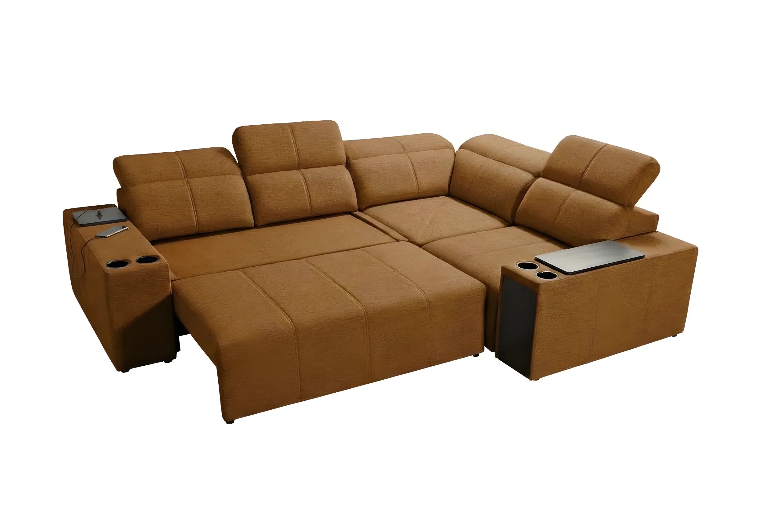
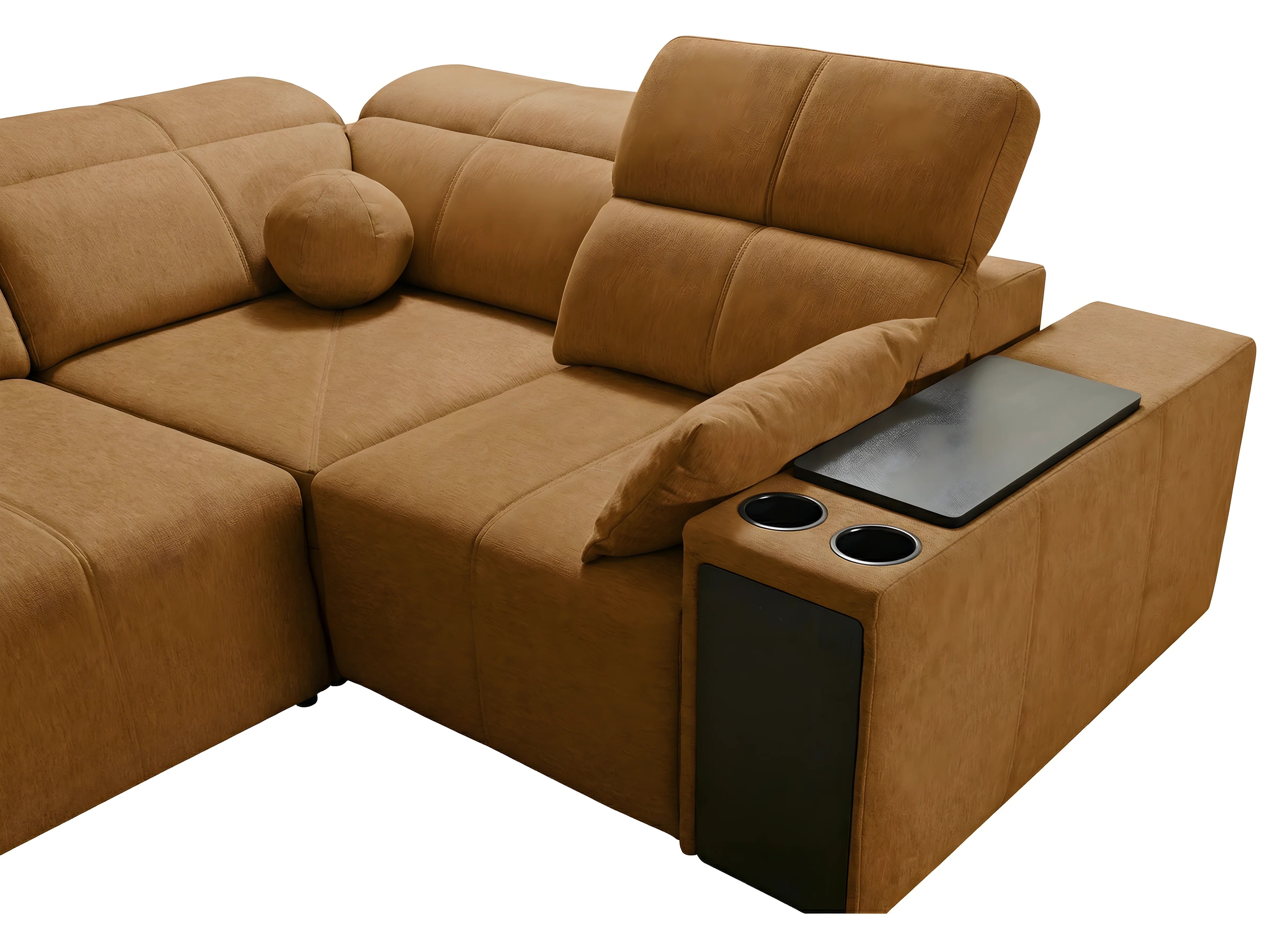
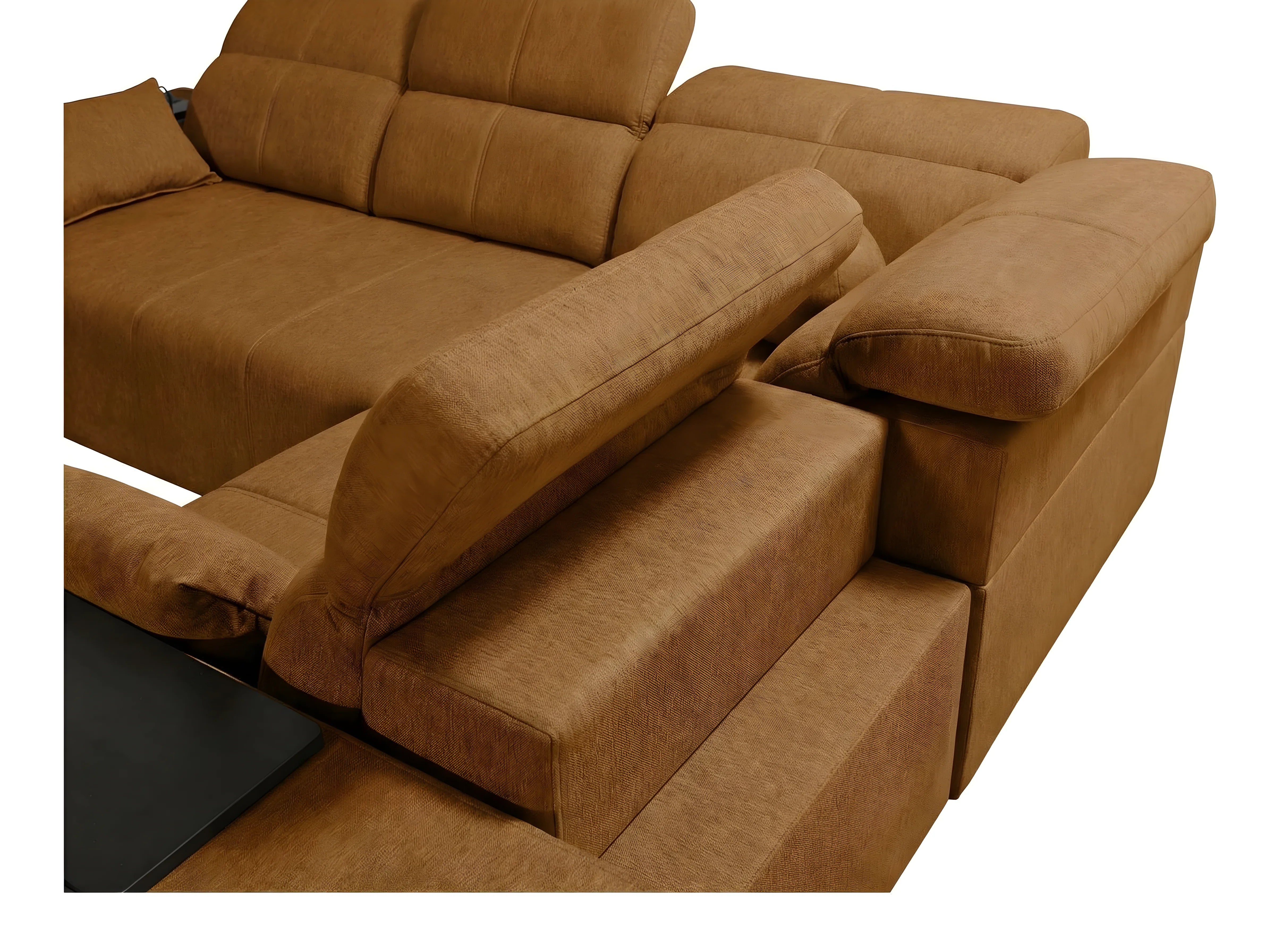
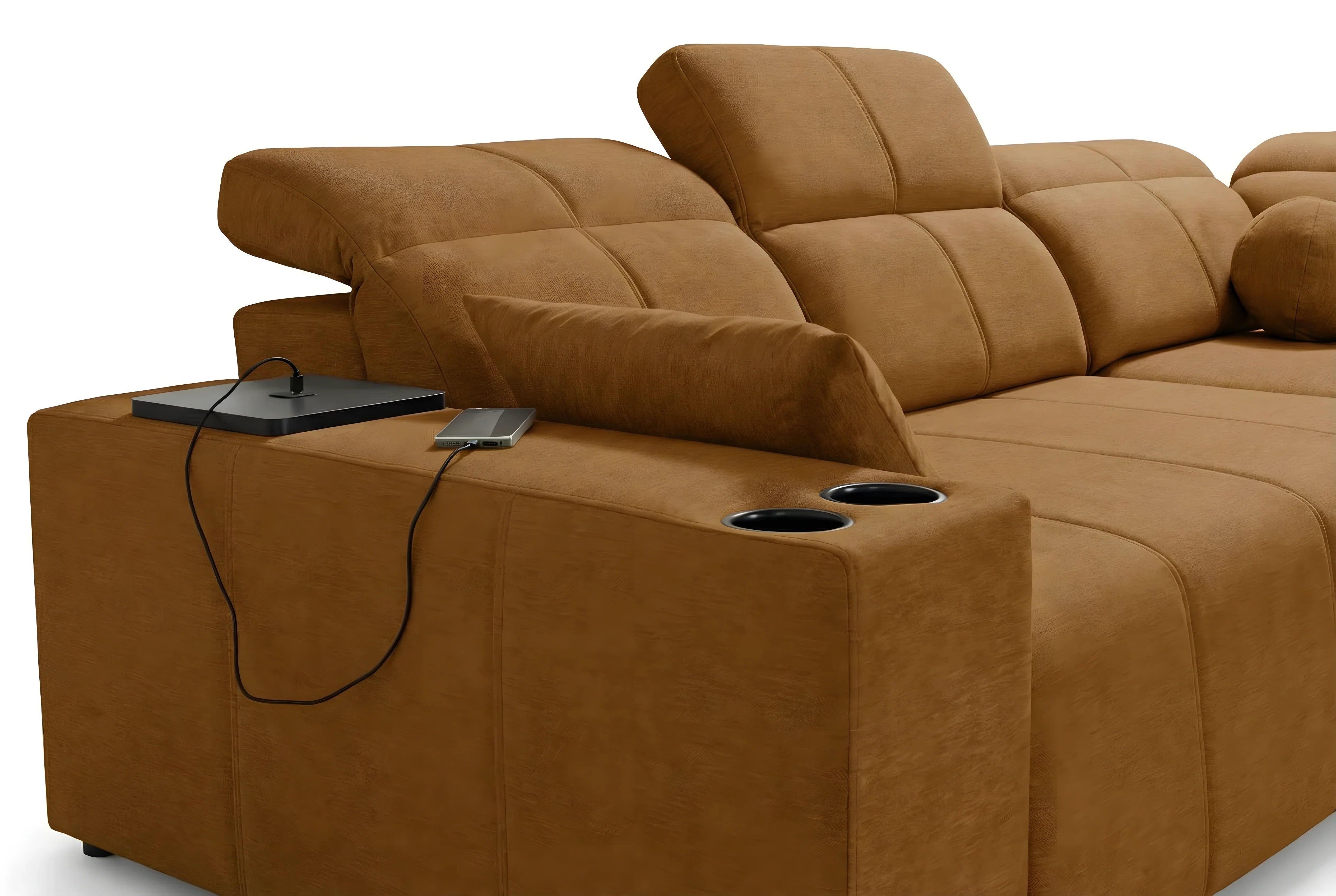
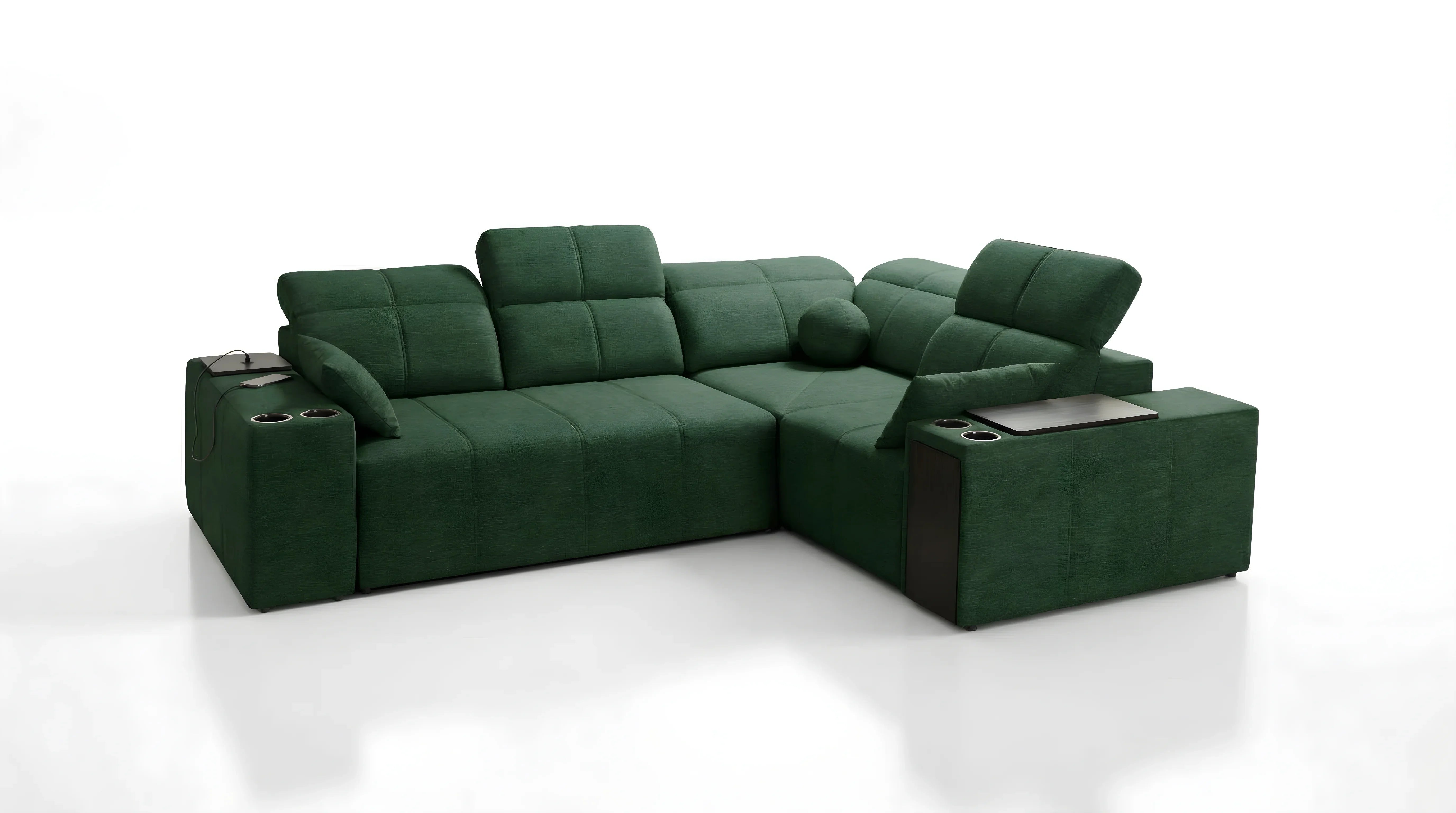
However, the excitement of the purchase often gives way to a question once the piece is delivered: how do you make this strong shade coexist with the rest of your décor? Whether you have fallen for colourful sofas in sunny or deep shades, the success of your layout depends less on the sofa itself than on the environment you build around it.
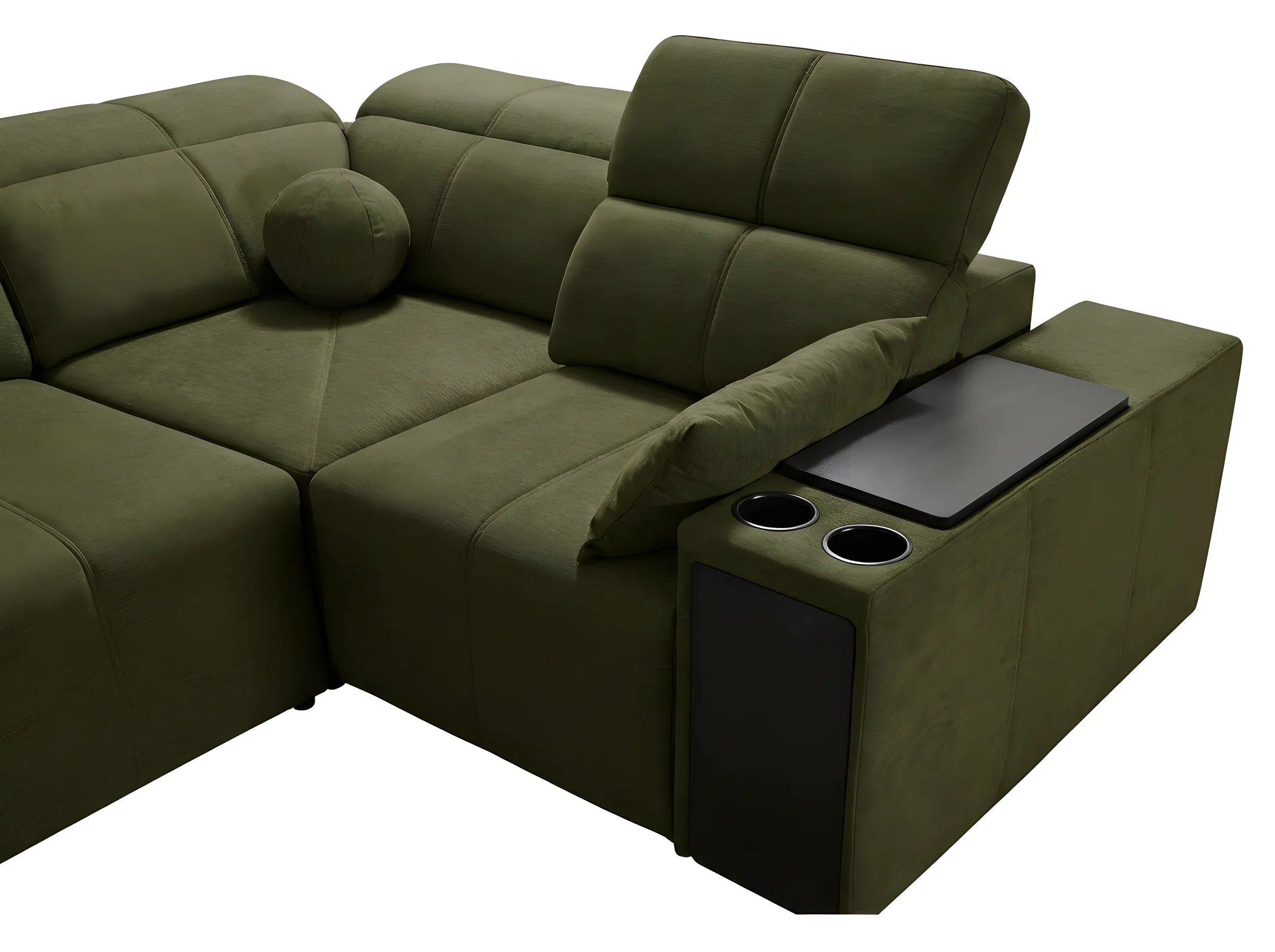
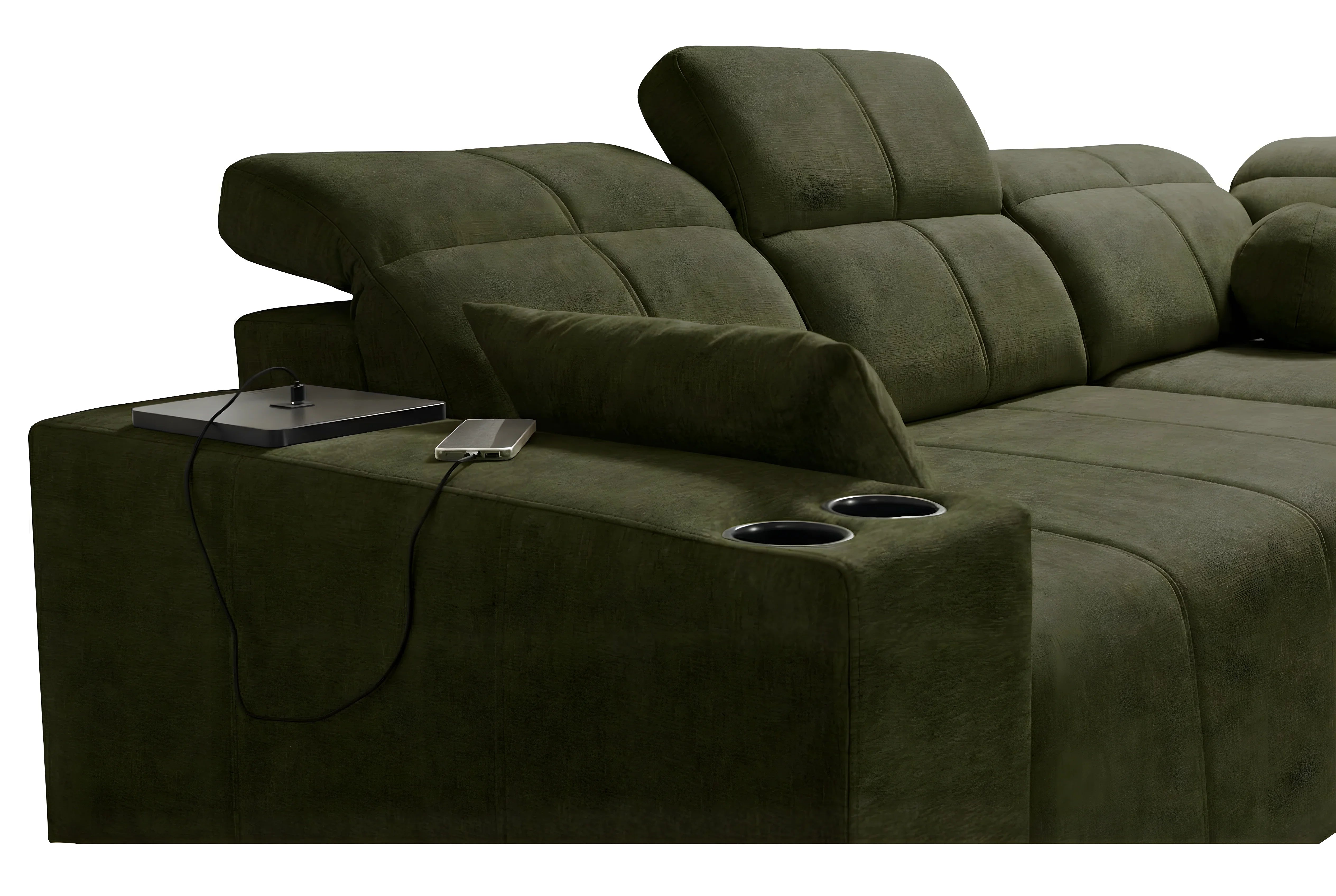
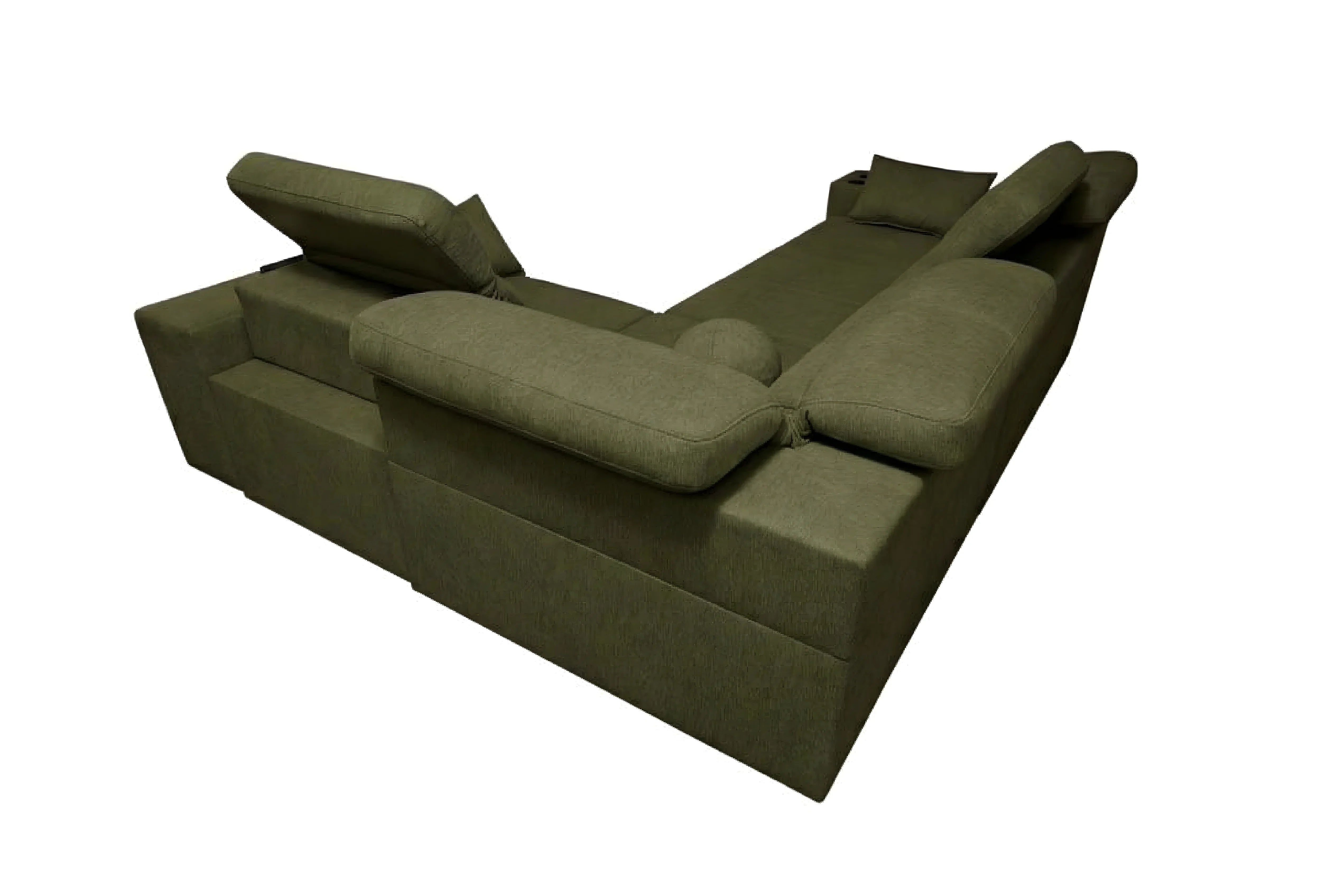
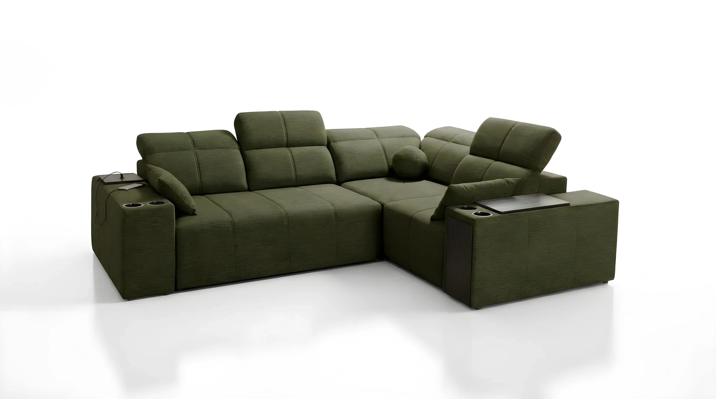
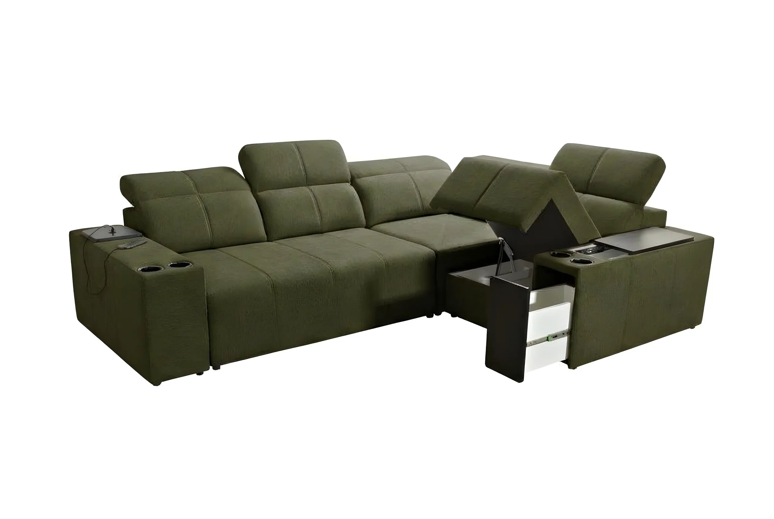
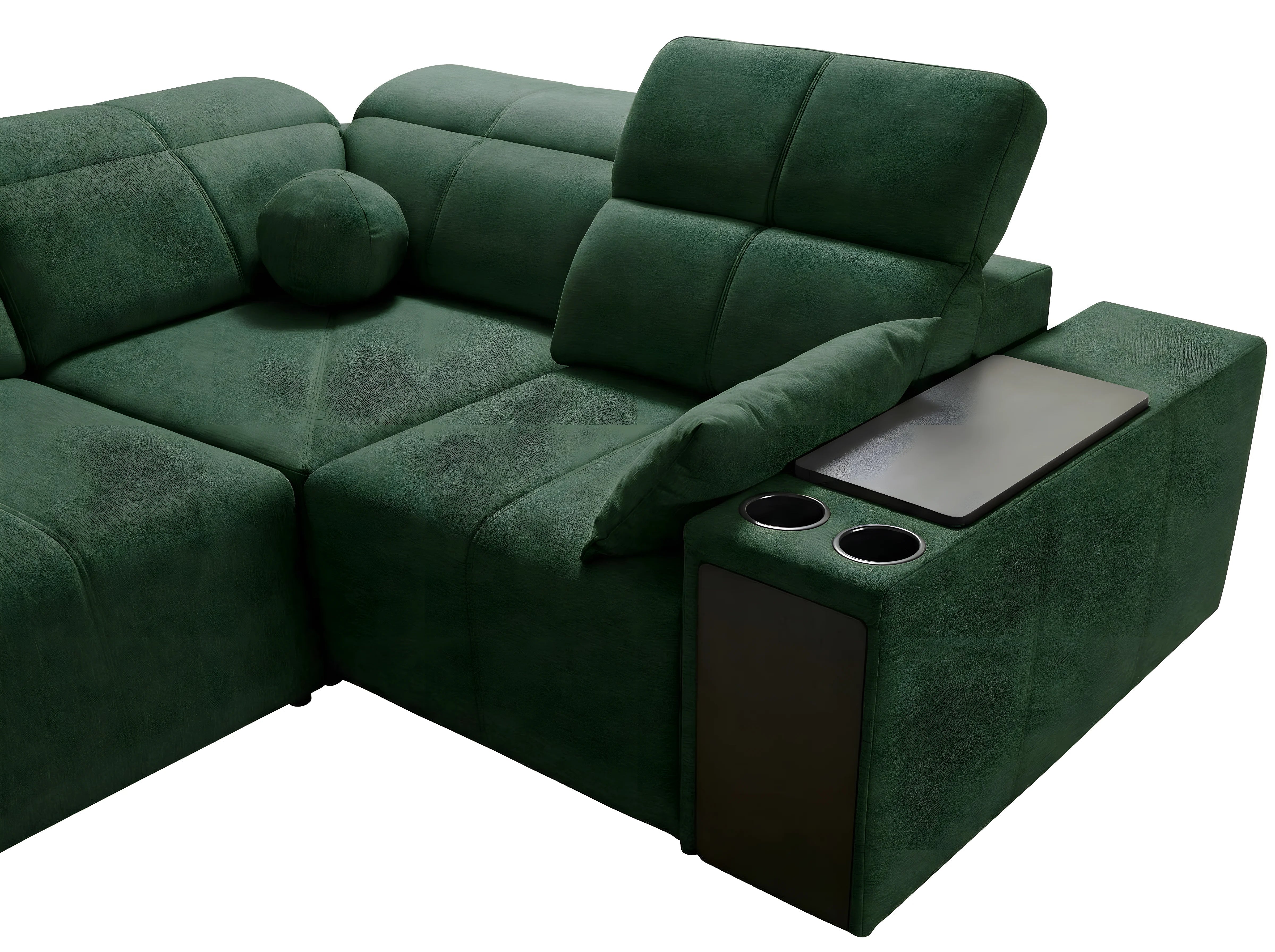
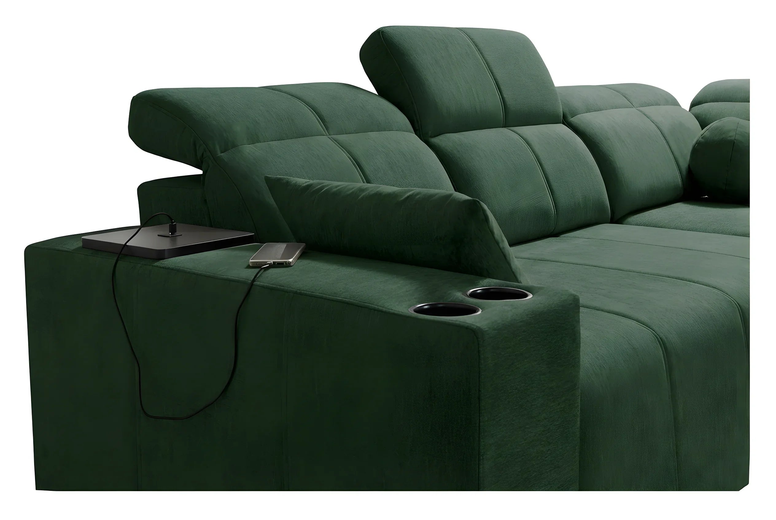
The sofa should not be a visual intruder, but the conductor that sets the tone. Whether it is emerald green, terracotta or deep blue, the methodology for integrating a coloured sofa remains governed by unchanging optical principles.
The 3 fundamental rules to harmonize the colour of your sofa
Before rushing to buy cushions or repaint your walls, it is essential to understand the stylistic mechanisms that govern visual harmony. Here are the theoretical pillars to nail your living room décor with a coloured sofa without a wrong note.
The 60-30-10 principle: the balance of shades
This is the golden rule used by every decorator to ensure a room stays pleasing to the eye. It defines the distribution of colours in the space:
- 60% dominant colour: This is usually the colour of your walls, floor or large rugs. To highlight a pigmented piece of furniture, this dominant shade is often neutral (off-white, pearl grey, light wood).
- 30% secondary colour: This is where your sofa takes the stage. It represents that visual third that draws the eye and gives character.
- 10% accent colour: These are the accessories (cushions, vases, frames). It is with these 10% that you will create the link between the neutral and the bright.
By respecting these proportions, even the most intense bright colours find their place naturally without smothering the volume of the room.
Complementary colours: the art of mastered contrast
To know how to harmonize a sofa's colour with the rest of your furniture, the colour wheel is your best ally. Two strategies are available to you:
The first is the approach of complementary colours. It consists of pairing shades that are opposite on the colour wheel to create a strong dynamic. For example, an orange sofa will vibrate intensely against a midnight-blue wall or accessories. It is an energetic choice, perfect for living areas where you entertain.
The second is the monochrome or analogous approach. Here, you work through neighbouring shades. If you have a modern design sofa in red, you will surround it with powder pink and terracotta. This method softens the impact of bright colours and creates a cocoon-like atmosphere.
Playing with materials and light to soften the effect
The perception of colour changes radically depending on the material. A red on leather does not have the same vibration as a red on linen. To ease the integration of a strong shade, texture plays a buffering role.
Velvet, for example, has this unique ability to absorb light rather than reflect it. A velvet sofa in petrol blue will look deeper, more shifting and often easier to match than a flat, shiny synthetic fabric. Material brings nuance. If you are afraid the colour will feel too "aggressive", opt for textured, bouclé or heathered fabrics that break up the uniformity of the shade.
From wall to floor: defining the ideal backdrop for your sofa
Once the basic rules have been absorbed, let's move on to practice. The background on which your sofa sits is decisive. It is what will either calm things down or dramatize the staging.
Which wall colour to choose (neutral, warm, cool)?
This is the most frequent question when looking to integrate a coloured sofa. There are three schools of thought:
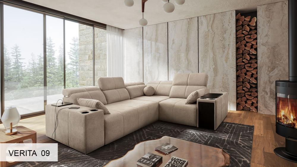
This is the safe option that works 100% of the time. A light wall puts the sofa centre stage like a work of art in a gallery. It lets the bright sofa breathe. It is ideal for Scandinavian or minimalist interiors.
Very bold, this consists of painting the wall behind the sofa in a shade very close to the sofa itself. This blurs the volumes and creates a very intimate atmosphere, often used in small cosy living rooms or libraries.
Paradoxically, dark colours on the wall bring out the brilliance of bright colours. A mustard yellow against a stormy grey wall becomes radiant and precious.
Choosing the perfect rug without weighing down the space
The rug is the ultimate transitional element for matching colours with a sofa. If your living room sofa is very colourful, the rug needs to calm things down. A black-and-white Berber rug, a natural seagrass or a heathered grey are safe choices.
Absolutely avoid a rug in the exact same colour as the sofa, as it would create a massive "block" effect that visually weighs down the room. If you want to echo the sofa's colour in the rug, do so in small, subtle touches within the patterns.
Case study 1: How to soften the shine of a Yellow Sofa (Mustard, Sun)
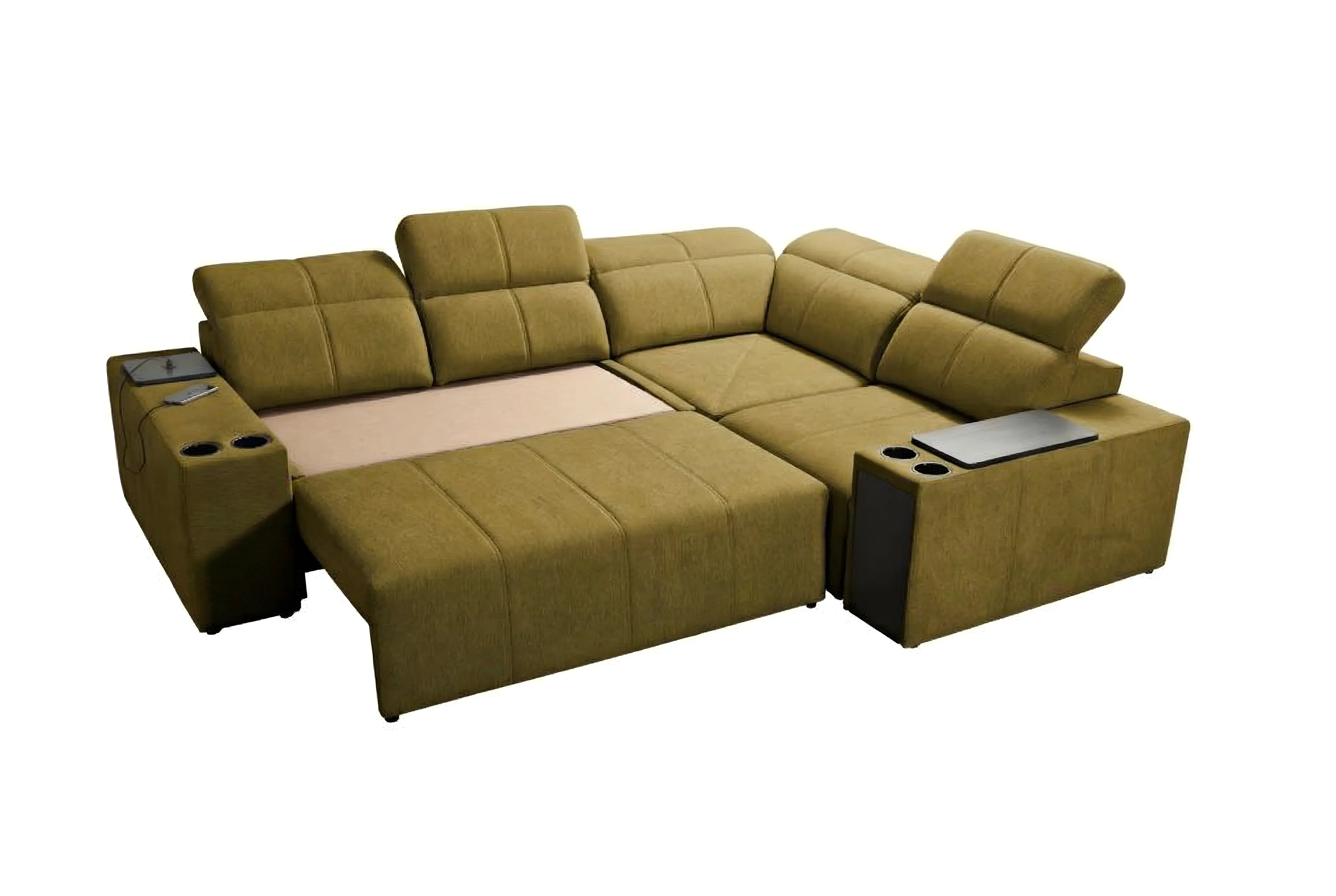
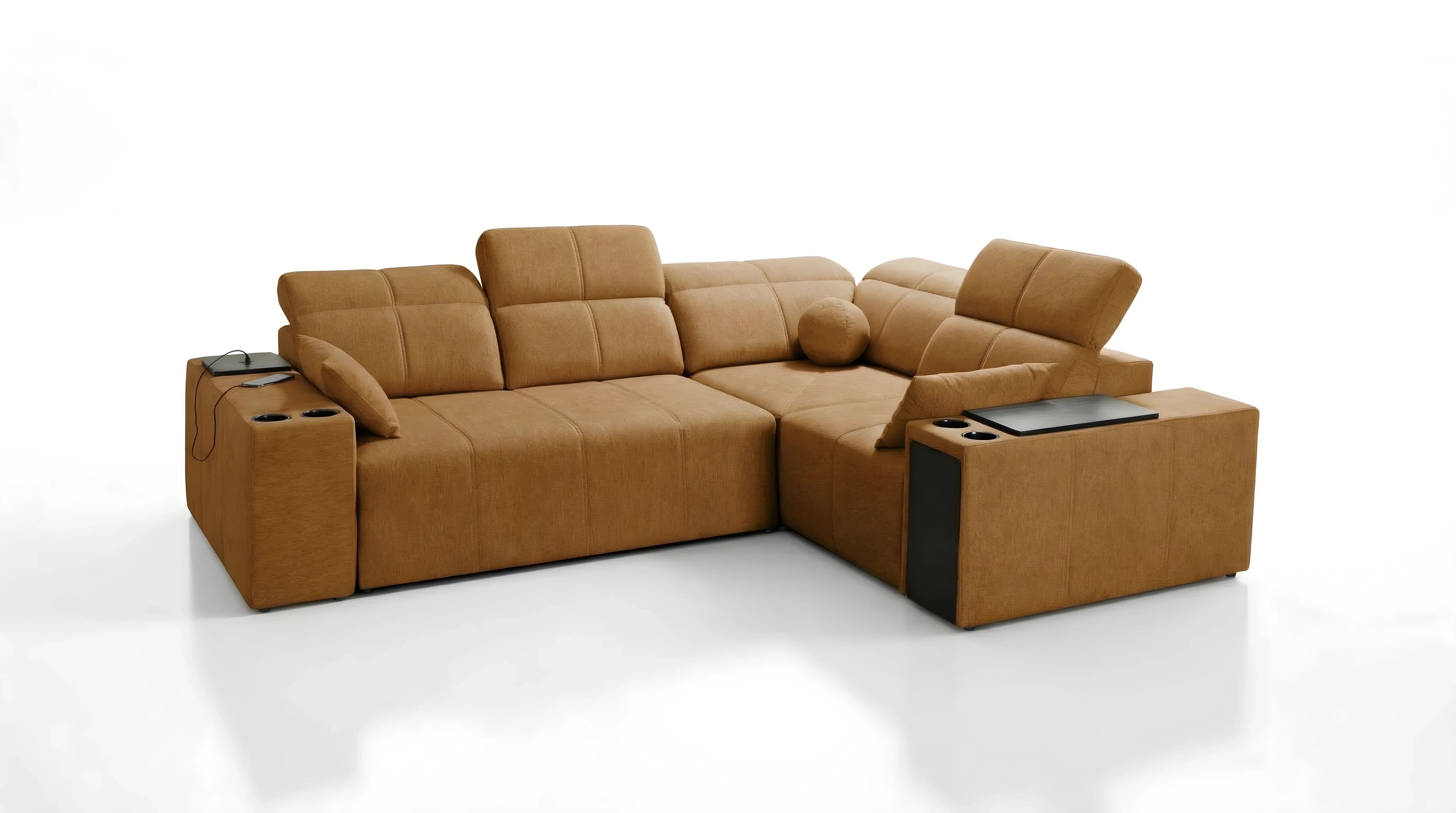
Yellow is the brightest colour on the spectrum. It brings joy and warmth, but can quickly become overwhelming. Whether it is a canary yellow or mustard yellow sofa, the goal is to temper it without dimming its light.
| Shade of Yellow | Best Wall Pairing | Complementary Materials | Décor Style |
|---|---|---|---|
| Mustard Yellow (Warm) | Peacock Blue, Charcoal Grey, Forest Green | Dark wood (Walnut), Brass | Vintage / Retro Chic |
| Lemon Yellow (Bright) | Pure White, Light Grey, Concrete | Black metal, Glass, Light wood | Industrial / Modern |
| Ochre Yellow (Earthy) | Terracotta, Sand Beige, Sage Green | Rattan, Linen, Ceramic | Bohemian / Natural |
To nail your living room décor with a coloured sofa with a yellow sofa, lean on grey. The Yellow/Grey pairing is a timeless classic of modern elegance. Add touches of black (table legs, light fixtures) to bring graphic punch and "frame" the colour. If you own a vintage-style sofa in yellow, don't hesitate to pair it with dark woods to reinforce its seventies retro feel.
Case study 2: The Teal Sofa, a classic: how to make it unique?
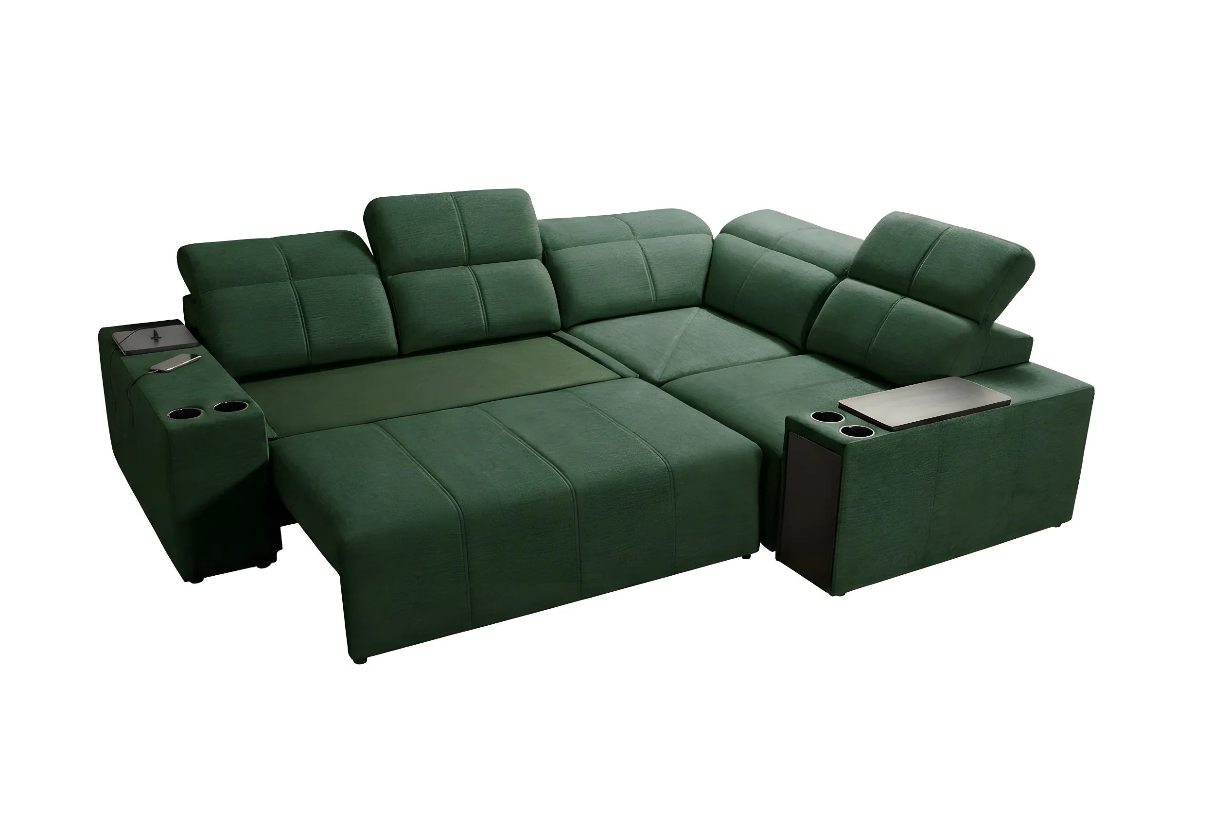
Teal, a subtle blend of blue and green, has established itself as the new neutral. It is less risky than yellow but still demands attention. A teal sofa brings immediate depth.
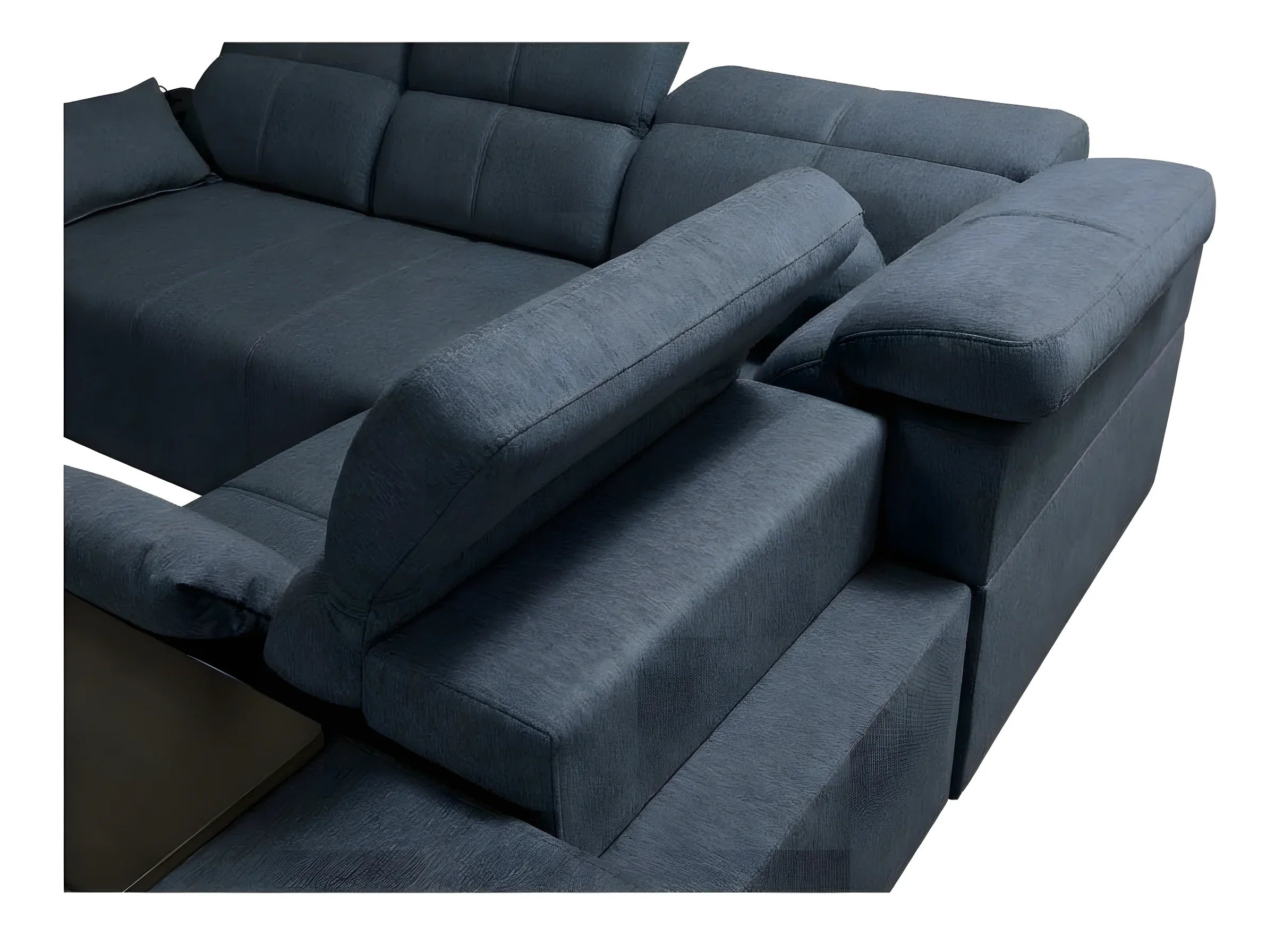
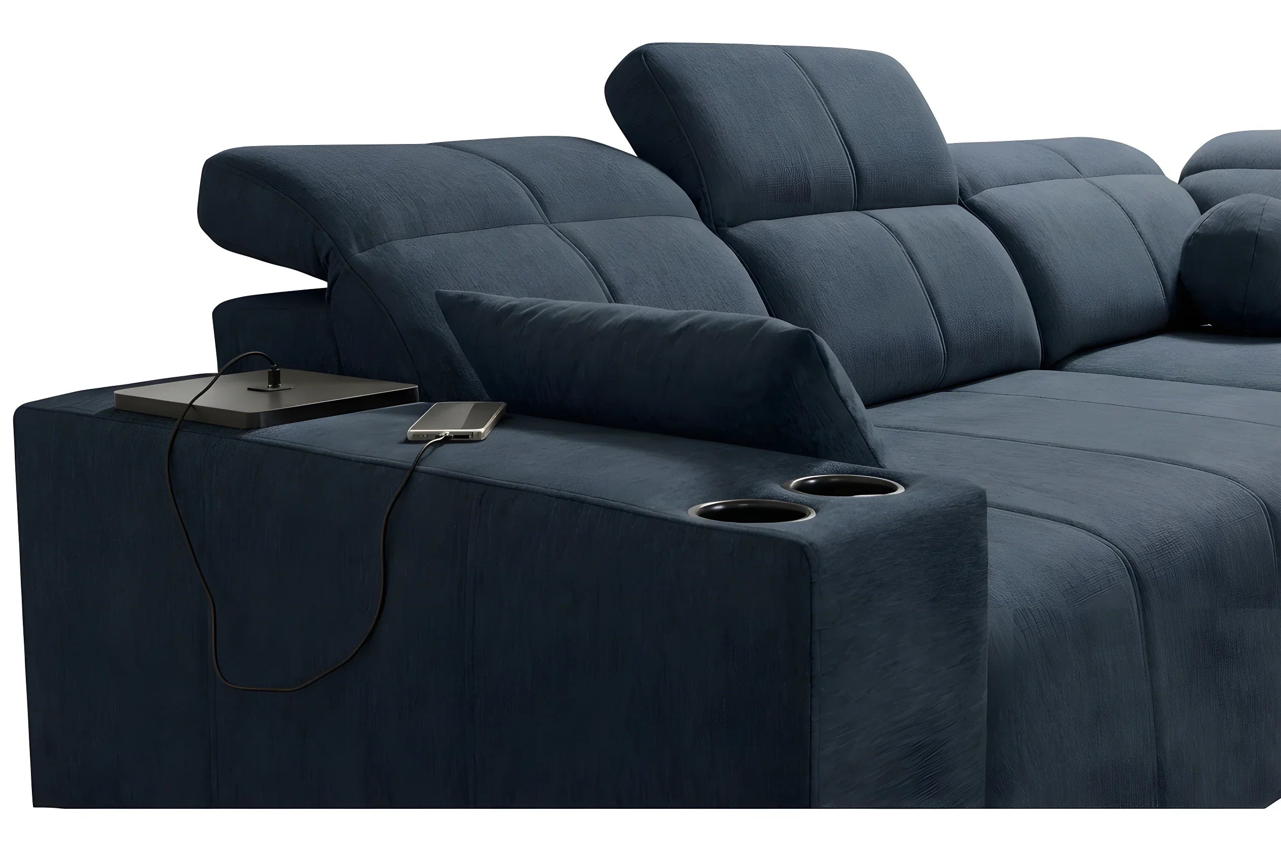
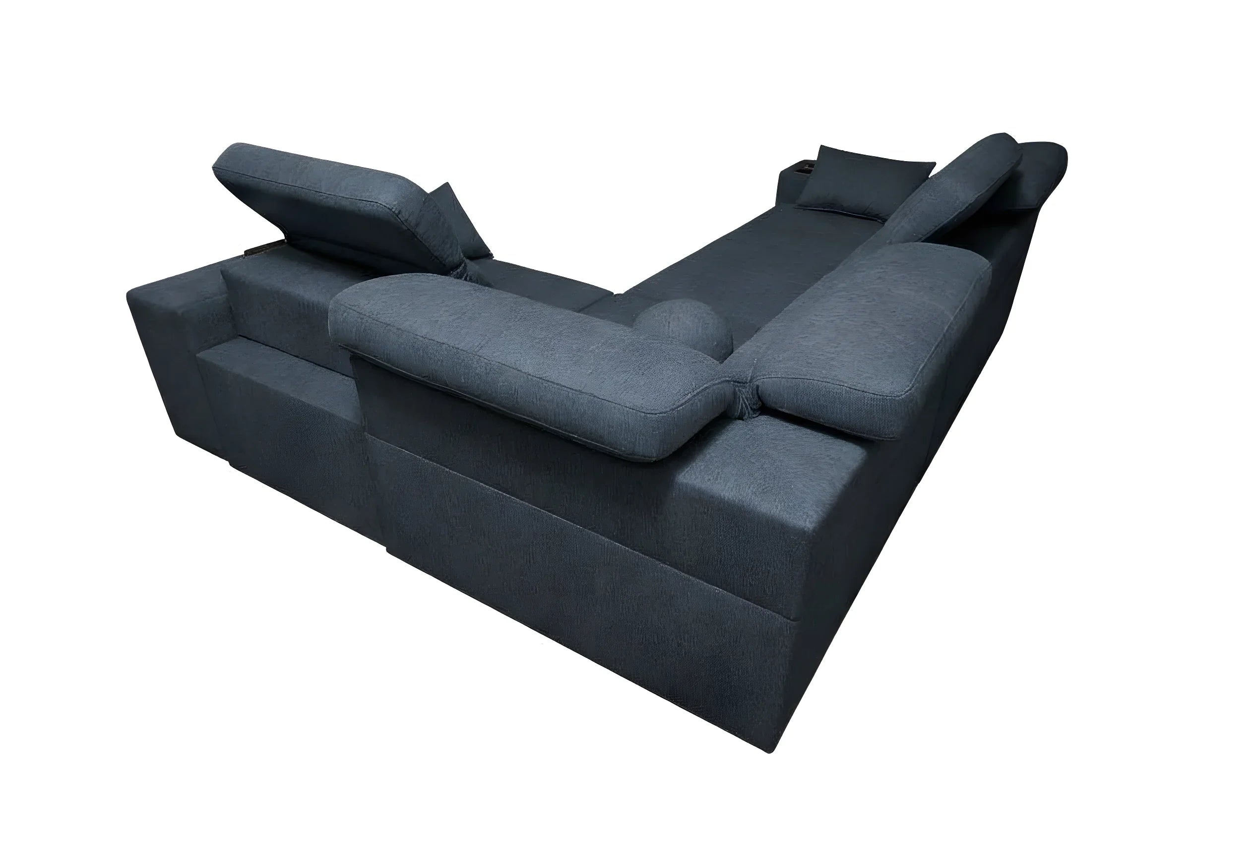
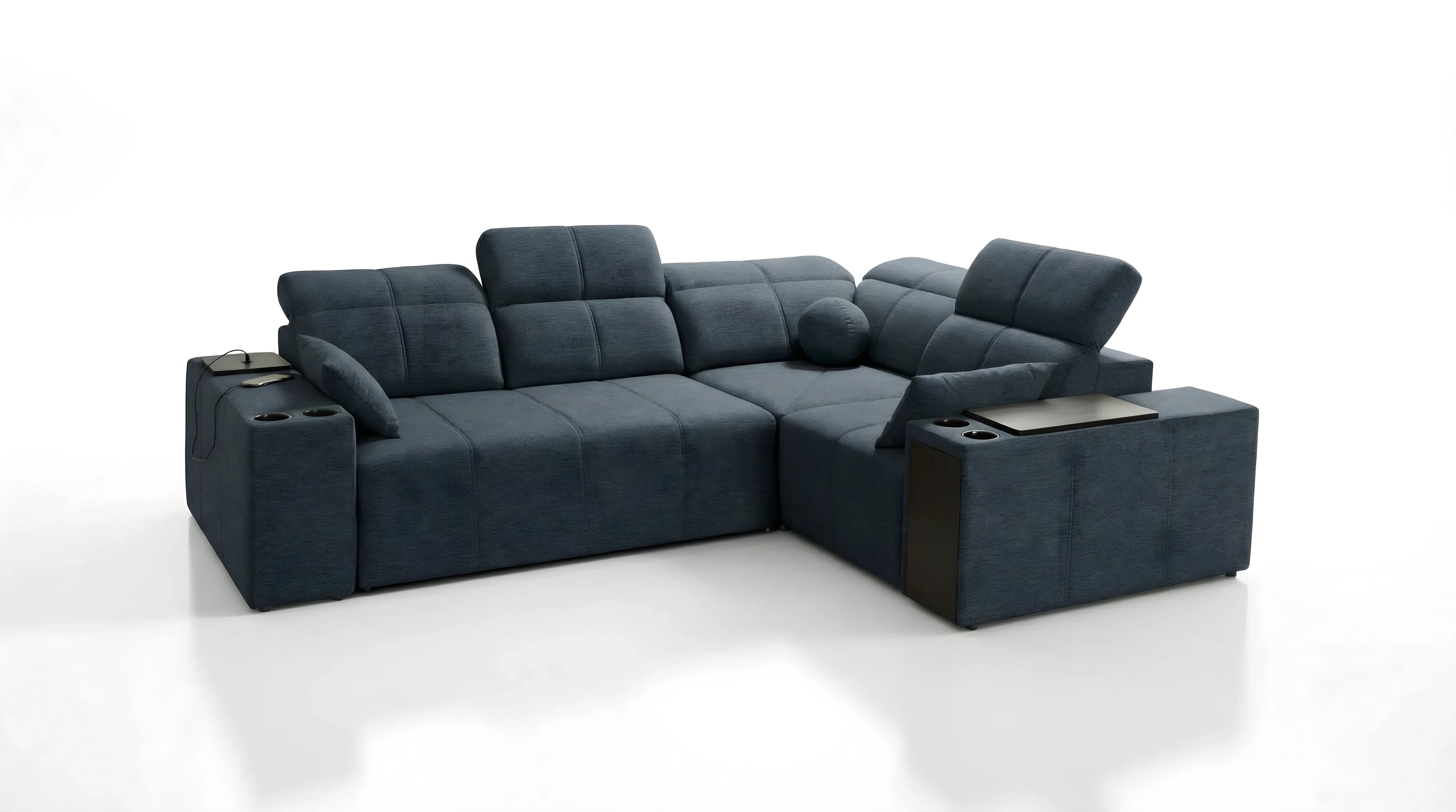
To elevate a teal corner sofa, the trick lies in adding metallic light. Teal and petrol blue pair beautifully with gold and brass. A coffee table with golden legs or a brass pendant light will awaken the green pigments hidden in the blue.
On the nature side, teal calls for greenery. Surround your sofa with lush green plants (Monstera, Ficus). The green of the leaves echoes the undertones of the fabric, creating a very soothing natural harmony. It is the perfect example to illustrate how to harmonize a sofa's colour with living elements.
If you want a more masculine or industrial atmosphere, cognac leather or raw wood are partners of choice for this type of bright colours.
Accessories and Internal Linking: the finishing touch of integration
You have the sofa, the walls and the rug. The finishing touch remains: the "styling". This is where you can have fun with more refined references.
For a solid-colour sofa, dare to use cushions with graphic patterns. On a solid sofa, the eye needs texture. Don't hesitate to mix a solid rectangular cushion with a square one in geometric patterns.
If you feel adventurous, why not explore the concept of the bicolour sofa through throws? Throwing a large throw in a contrasting colour across the seat visually changes the colour mass of the sofa. It is an ideal trick if you find that your bright sofa visually takes over too much in certain seasons.
Finally, don't forget wall art. A large painting above the sofa that contains a touch (even a tiny one) of the sofa's colour will create an invisible vertical link, anchoring the piece definitively in the room. It is this detail that takes your interior from "furnished" to "decorated".
FAQ: Your questions about colourful décor
What type of cushion to put on a teal sofa?
For a teal sofa, three options work perfectly: mustard yellow for a dynamic contrast (retro style), powder pink to soften the whole look (Scandinavian style), or black-and-white geometric patterns for a graphic and chic rendering. Avoid an exact tone-on-tone that flattens the sofa's relief.
Should you choose light or dark furniture with a bright sofa?
It depends on the atmosphere you are looking for. Light woods (oak, pine) soothe bright colours and create a luminous, Nordic feel. Dark woods (walnut, teak) or black metal bring character, maturity and a more luxurious look, particularly suited to deep velvets.
How does the colour wheel work for decorating around my sofa?
Locate your sofa's colour on the wheel. The colour directly opposite is its complement (example: blue opposite orange), ideal for creating strong contrasts in small touches. The colours sitting right next to it are the analogous ones, perfect for creating harmonious, eye-soothing gradients.
Does a strong-coloured sofa go out of style quickly?
Not if the integration is successful. Bright shades like mustard yellow, fir green or teal have become "new classics". To avoid weariness, keep the rest of the room (walls, floors, curtains) in neutral tones. It is easier to swap cushions and a rug to refresh the style than to change the sofa itself.
Conclusion: Dare to use colour, we master the rest
Knowing how to integrate a bright sofa (yellow, teal) into your living room is not a question of innate talent, but of respecting proportions and harmonies. By applying the 60-30-10 rule and carefully curating accessories, your sofa becomes the soul of your home, reflecting a bold and warm personality. At Kings Canapé, we understand that choosing colour is an emotional commitment. That is why our collections offer a variety of shades and materials designed to harmonize durably with your interiors, allowing you to dare with design without ever sacrificing elegance.



Leave a comment
This site is protected by hCaptcha and the hCaptcha Privacy Policy and Terms of Service apply.